Any online retail store owner wants their business to thrive.
This is exactly the reason behind the choices made in favor of implementing new modern technology on website, never-ending optimization works, UI/UX experiments, as well as moves toward building a progressive web application that can raise mobile conversion rates.
To help you get started, in this article you can get a hold of tips on 5 essential website elements of a selling eCommerce store that can make their way to your store too. To back up the given ideas, we’ll illustrate some great examples of such element use on famous eCommerce websites.
1. Play Around with Your Category Pages
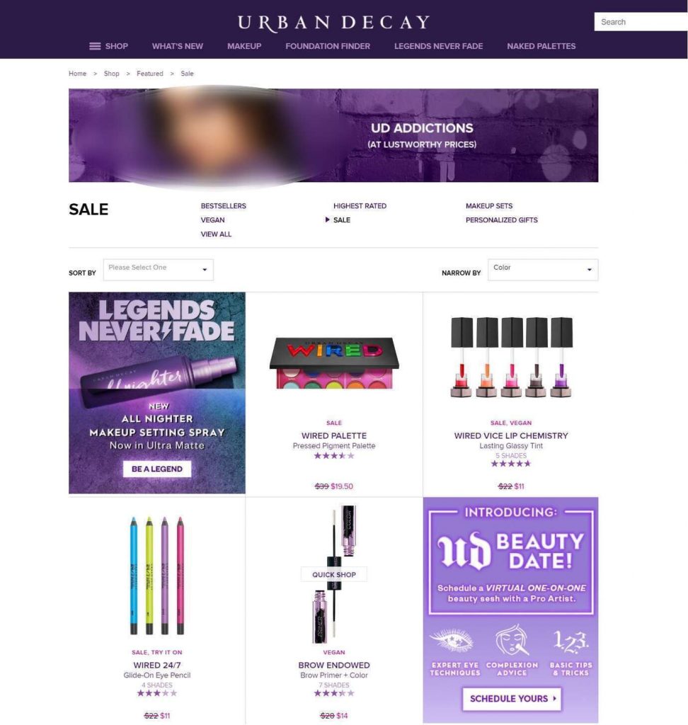
Spicing up your product grid with some low-key banners is among the simplest ways you can use to start selling more on your online retail store. The thing is that people eventually get bored as they scroll through extensive product listings. This is your chance to grasp user attention by displaying mini-banners with some special offers, new arrivals, or some other deals that you may find appropriate to show.
As of recent, many designers even sprinkle up these category page banners with GIFs, video elements on autoplay, or even 3D product rotation.
An example of such element use on category pages is on the screenshot below, taken on the official Urban Decay website. As you can see, mini ad banners replace some of the products within the grid. The two that are displayed on this page are devoted to introducing a new product and an invitation to join an activity. Importantly, both banners have buttons that can take your buyers to the needed page in just a single click.
Screenshot taken on the official Urban Decay website
2. Make Product Picks Personal
The “you might also like” blocks are a real thing if they’re implemented correctly. As a rule, such functionality runs on the basis of artificial intelligence. That said, AI analyzes the behavior of your users: what they browse, what they add to their shopping carts, and what they actually buy. It can even segment users into groups by interest or similar behavior.
With such information available, the product selection that the user sees on a product page or just across the site is a way more targeted pitch rather than a “one-fits-all” approach.
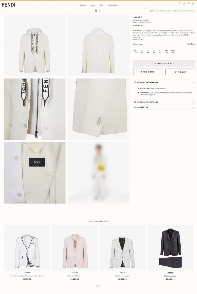
Below is an example of the “You may also like” block on the official Fendi website. Here we can see similar-style items, not just the pitch of products from the same collection or of same color.
Screenshot taken on the official Fendi website
Any online retail store owner wants their business to thrive. This is exactly the reason behind the choices made in favor of implementing new modern technology on the website, never-ending optimization works, UI/UX experiments, as well as moves toward building a progressive web application that can raise mobile conversion rates.
To help you get started, in this article, you can get a hold of tips on 5 essential website elements of a selling eCommerce store that can make their way to your store too. To back up the given ideas, we’ll illustrate some great examples of such element use on famous eCommerce websites.
3. Cross-Sell & Upsell Wisely
Mentioning more strategies for obtaining additional sales, eCommerce stores surely shouldn’t miss out on great upselling and cross-selling sections.
Let’s face it, what are the chances that a person will spend a lot of time searching around on your store on their own looking for something to match the item that they’re planning to buy? It’s not very likely that your customer will spend loads of their time going through dozens of your product categories and pages, singling out products from the same product line, collection, or just those that can be a basic match.
This is exactly why such work should fall on the shoulders of store owners. It must be easy for someone browsing the product to find other parallels that you sell. This greatly boosts spontaneous purchases! For instance, your customer didn’t initially plan on buying a case for the sunglasses that they want to get in your store but if you carefully pitch them the idea that this can look good or is useful or etc, the probability that this extra item will make it to the cart rises.
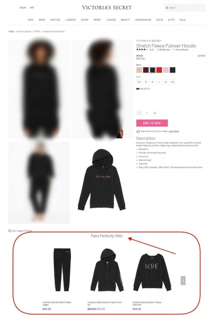
For instance, this is how the “Pairs perfectly with” block looks like on the official Victoria’s Secret website. The block suggests three items that’ll look well if coupled with the hoodie that’s currently being browsed.
4. Link-Up Social Media Widgets
Undoubtedly, hooking the store’s social media account with the site is a very smart move.
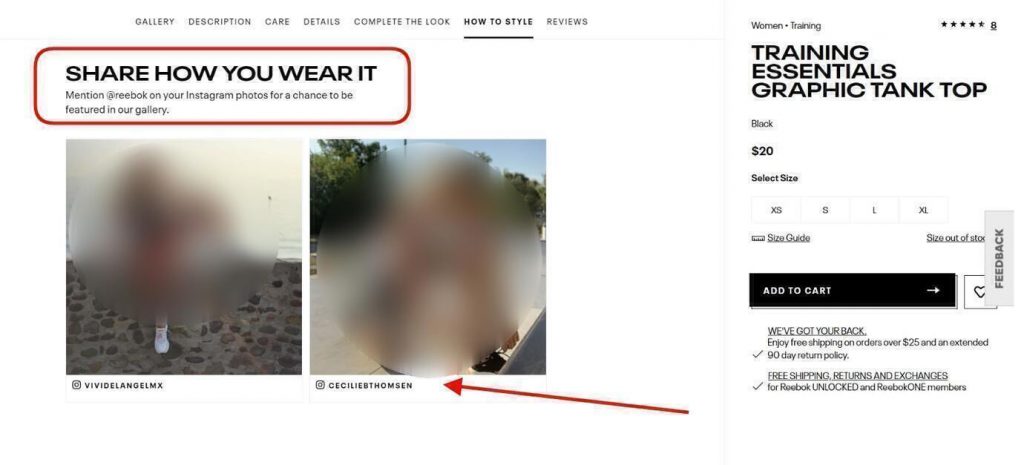
I really like how the official Reebok website has organized its user-generated content block from socials. The “Share how you wear it” urges customers to make posts on their own Instagram accounts, tag Reebok’s account, and if the picture is good, the customer can make it to the gallery on the website. This is quite alluring for many of those people who care about views, followers, and “likes” since if they make it onto the page, there’s a big chance that their viewership grows.
But what does this mean for you as an eCommerce store owner? This one’s easy. You get only benefits by having such an element on your website:
- By showing pictures of happy customers, you inspire and convince those who are browsing the item to buy it.
- This element makes product pages more appealing.
- Such user-generated content is a real hit, it’s social proof that you can use to your store’s advantage across many channels.
- You build stronger relationships with existing customers who make the posts.
- Your brand and its social media account gets a wider viewership too.
Screenshot taken on the official Reebok website
5. Plug In “Virtual Try-On”
This element that uses augmented reality is an outstanding and modern step up for many spheres of eCommerce. “Try it on” blocks that function by switching on the user’s camera on their device and helping to visualize what the product will look like on them are perfect for clearing away doubts of your potential buyers and existing customers.
What you should understand here is that many ends meet at one point if you have such a feature in your store. It’s interactive and engaging, it’s fun to use, and it’s very useful too.
Case in point: people can put the focus on their smartphone’s camera on their feet and see how a pair of sneakers looks on them. The person doesn’t have physical access to the shoes to try them on in reality, but with the help of such a feature, it becomes much easier to visualize what the item will look like on you even if you’re shopping online. As a result, people make purchasing decisions more bravely, and your sales grow.
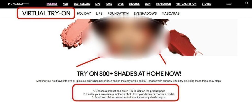
To provide you with an example, M·A·C Cosmetics is already effectively using this functionality on their eCommerce website. Their Virtual Try-On feature allows users to test makeup and play around with shades either by using their live camera, by uploading a picture of themselves, or by seeing the results on a model.
Screenshot taken on the official MAC Cosmetics website
In Closing
Summing up everything covered in this article, practically any eCommerce store has room for improvement. This is exactly why it makes sense to opt for experimenting with new site elements and functionality as well as turning to the best practices. Hopefully, these five page elements, examples, and tips can help your store start selling more!
Written by Alex Husar
About the Contributor
Alex Husar, CTO at Onilab with 8+ years of experience in Magento migration and Salesforce development services. He graduated from the Czech Technical University and obtained a bachelor’s degree in Computer Software Engineering. Alex’s expertise includes both full-stack dev skills and a strong ability to provide project-critical guidance to the whole team. Mr. Husar can be reached at alex.j.husar@gmail.com.
